
RAICES
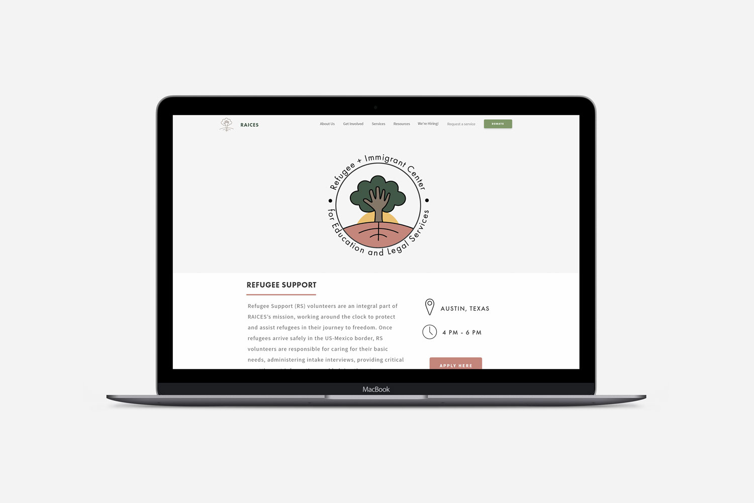
RAICES
iOS and Desktop Redesign
User Experience, Visual Design
RAICES is a Texas based nonprofit that offers free and low-cost education and legal services to immigrants and refugees. The organization is the largest immigration legal services provider in Texas with a deep commitment to advocacy and representation for separated and detained families.
I have prior experience mentoring and tutoring refugees, so assisting this cause is close to my heart. Our team wanted to encourage the local community to take action by redesigning and streamlining the volunteer onboarding process.
PROJECT SCOPE
Our goal was to first define the problem in order to effectively design a solution. Volunteering addresses the human need of wanting to belong and accepted within a community, so it was our intention to make the sign-up process as engaging yet simple-to-use as possible.
PROBLEM
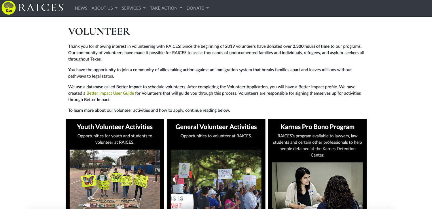
The RAICES webpage is cluttered with large blocks of text and difficult to navigate. Users cannot easily find the forms to volunteer since the links and descriptions to opportunities are scattered and poorly organized.
GOAL
Our focus was to enhance the user experience by redesigning the volunteer onboarding process. We set out to make some functionality improvements on RAICES’ homepage to make it more responsive and easily digestible.
DEFINE
USER PERSONA
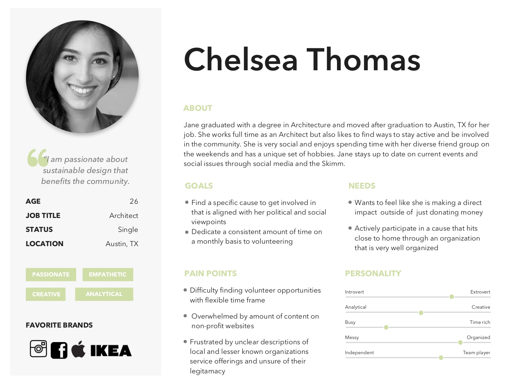
After compiling our observations of real people and looking for patterns within the data, we created archetypal users. The users represented different needs, abilities, behaviors and values that allowed us to create stories about desires and hangups when it came to the volunteering sign-up process.

USER STORIES
We created a storyboard of a hypothetical situation that illustrated the before, during, and after stages of signing up to volunteer with RAICES and the emotional journey.
DESIGN AND IDEATE
Wireframes and Lo-fidelity Prototyping
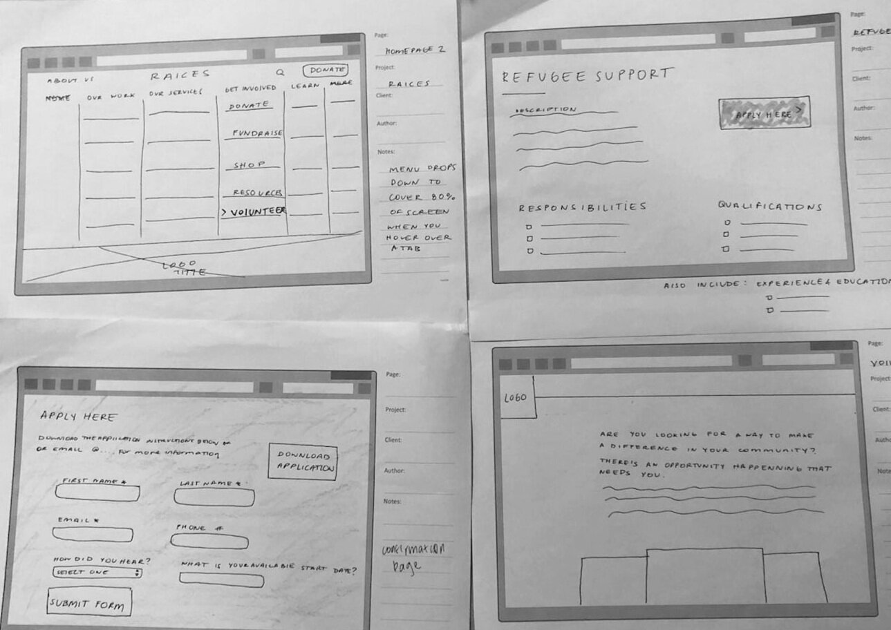
Based on the insights collected, we sketched out wireframes of potential solutions and layouts. We made paper prototypes to test the process and continued iterating based on the feedback received

Logo
RAICES stands for “roots” and with the redesign, we wanted to re-create a logo that conveyed endurance and belonging in a graphic form. We aimed to create a logo personality that was warm and inviting with a balance of visual elements.

Style Guide
Once the wireframes were refined and tested, we created Style Guides to establish the overall tone and aesthetic direction
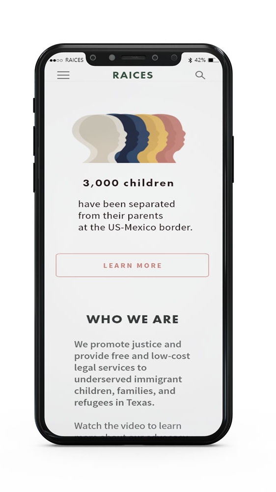
It was important that the design and UI components reflected the organization’s purpose of being warm and inviting so we chose a color palette that was consistent with that message. By simplifying the design we were able to declutter the information presented and balance the visual elements with the use of typography, negative space, etc.
PROTOTYPE
High Fidelity Mockups
Once the UI design system was refined and tested, we created high fidelity prototypes for user testing
View Mobile Prototype
View Desktop Prototype