JOHN & JACKIE
User Research and UX Design

OVERVIEW
John & Jackie is a modern gifting company that offers custom and curated gift boxes. With the mission of providing uniquely creative gifts for all reasons and seasons, John & Jackie allows customers to send ready-made gift boxes or to build your own box through a “BYOB” tool.
CLIENT
TEAM
MY ROLE
JOHN & JACKIE
CHRISTINA NGUYEN
VICTORIA NGUYEN
USER RESEARCH
USER INTERFACE DESIGN
VISUAL DESIGN
PROBLEM statement
Although the tool was intended to be easy to use, we found that conversion rate for purchased gift boxes from the “BYOB” tool was significantly lower compared to purchases made for prepackaged boxes.
DESIGN SOLUTION
In order to increase the conversion rate, we need to optimize the user experience of building your own box. By better understanding user behavior, gathering data on interactions, and conducting usability testing, we can locate areas of opportunity and evaluate the success (or lack thereof) of design changes.

Empathize
I first wanted to discover who our users are and better understand their needs and expectations surrounding online gift shopping.
Survey
I created a Typeform questionnaire and conducted the survey with 20 participants in the key demographic of 18-45.
I learned:
1. 80% of respondents shop for gifts online
2. Price and uniqueness of gift were rated as the most important qualities when online gift shopping
3. 76% wanted to spend less than 1 hour shopping for gifts
When shopping online for gifts, I want to easily and quickly find good recommendations so I do not have to wait until the last minute to buy a gift.
When looking for unique gifts online, I want to be able to personalize my gift so my recipient knows a lot of thought and effort went into it.
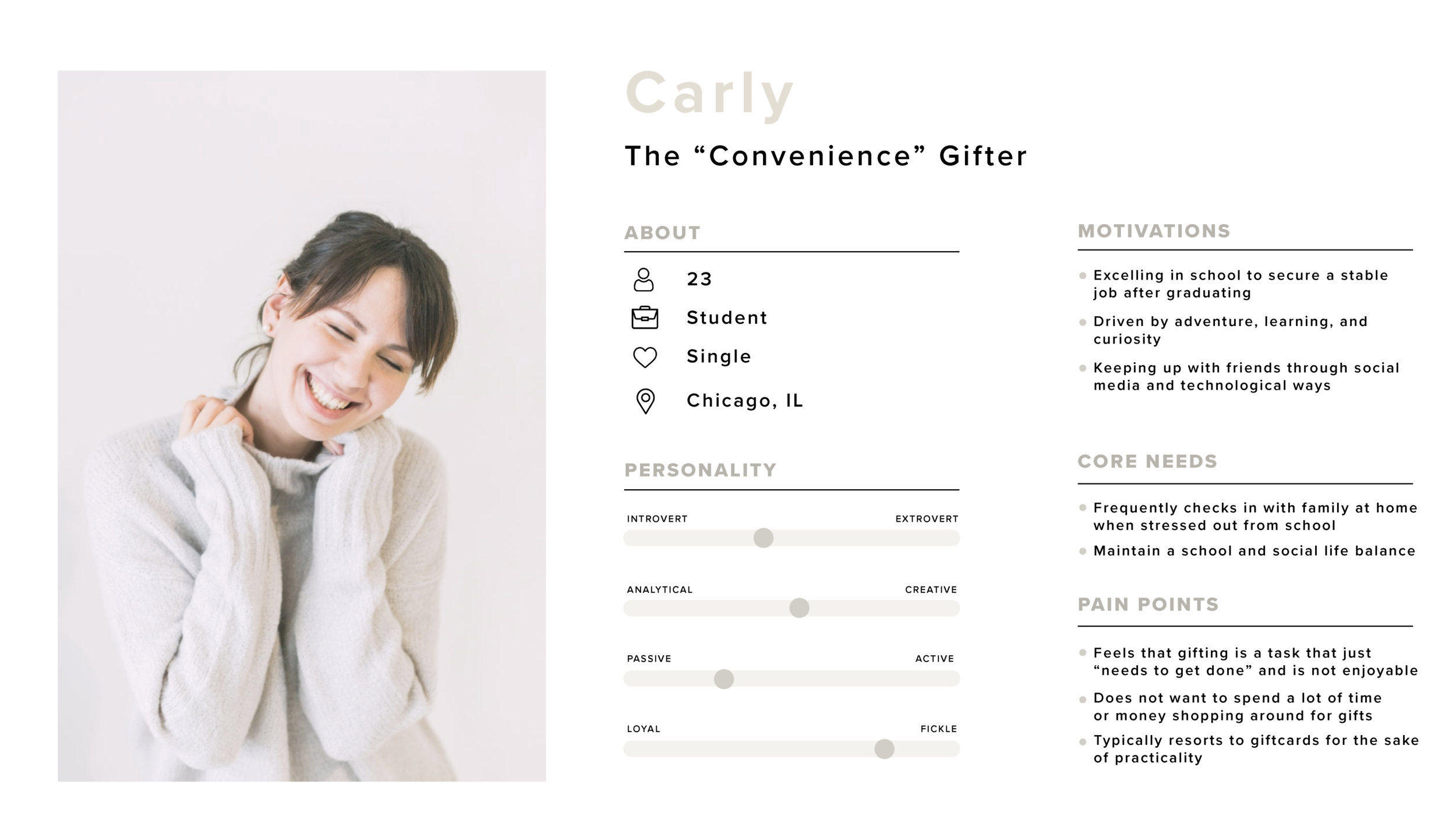
USER PERSONAS


Define
AFFINITY MAPPING
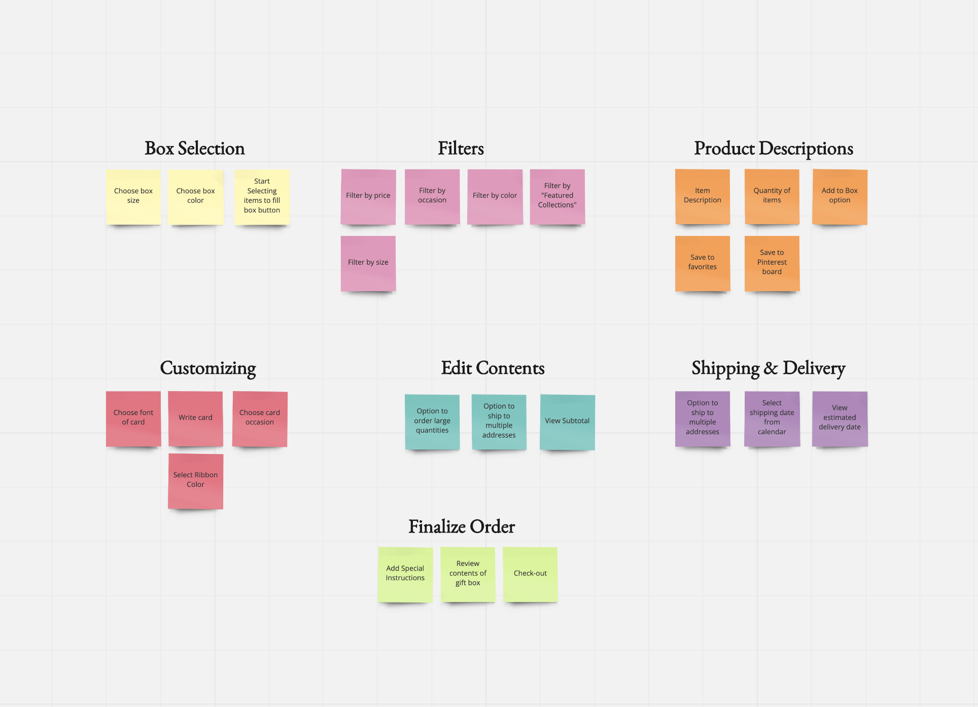
I reviewed recordings of the testing sessions carefully and categorized the steps each user went through for building their gift box. I used affinity mapping to organize and group the tasks to better understand the barriers and how we can simplify the process.
Ideate
LO-FIdelity


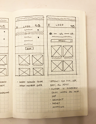
Prototype & Test
USABILITY TESTING
Actionable Objectives:
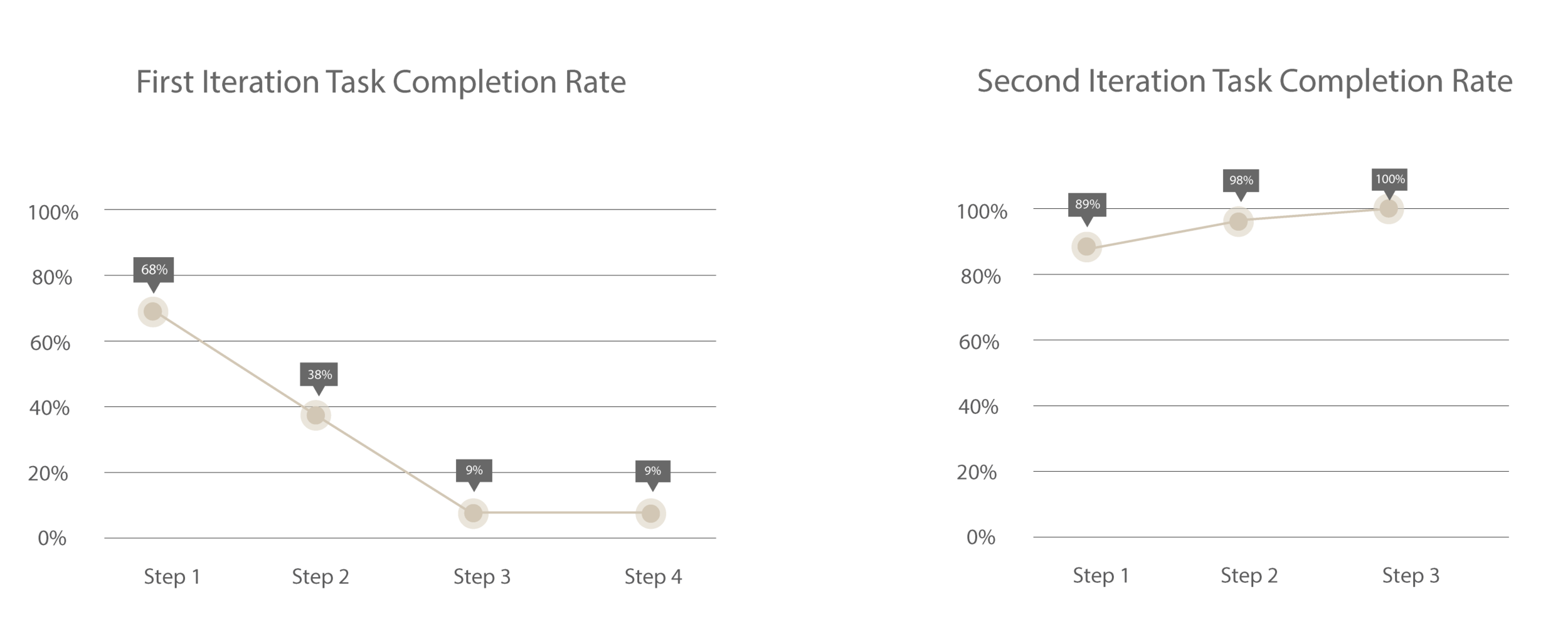
Learn if participants are able to complete specified tasks.
Identify how long it takes to complete specified tasks and how generally happy users are with the site.
Challenge 1: filter
Challenge : Users were frustrated with the lack of filtering options and quickly lost interest after viewing the first few products
Solution : Designed filters that allowed the user to sort by theme/occasion, price, and item size
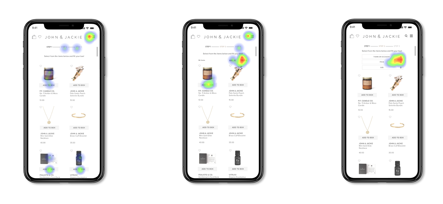
Original Design Heatmap Iteration #1 Heatmap Iteration #2 Heatmap
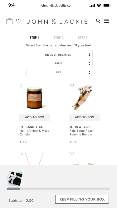
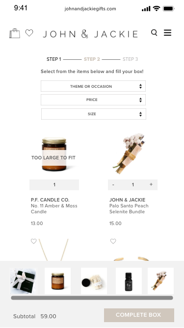
CHALLENGE 2: Showing progress
Challenge : Users were confused by how many items they can put in a gift box
Solution : Design a fixed component that showed the user the progress towards completing a box. Items too large too fit are grayed out with a notification that states, “Too Large to Fit.”
Average error rates for the task in the original tool was 9.8 errors. After the redesign, error rates went down to 0.6 errors.

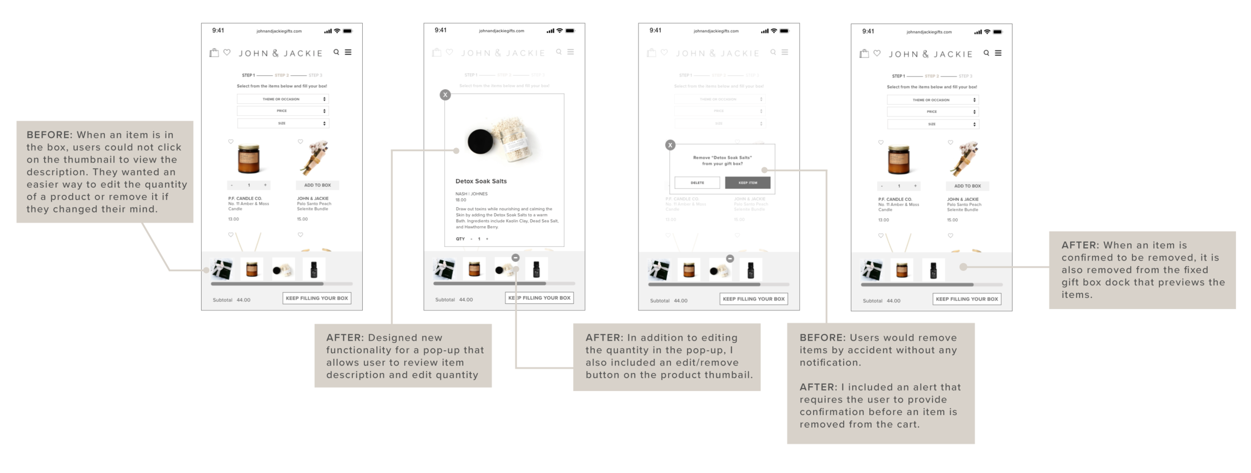
CHALLENGE 3
Challenge : There is no way to review the product description or edit the quantity of an item in the cart, which means users would have to browse for the item again
Solution : Designed a pop-up when the thumbnail of a product was clicked and also added a alert that required user confirmation prior to removing item.
BEFORE:
Only 1 out of 7 did so without problem
6 out of 7 users tapped the item, which didn’t bring up a picture
3 out of 7 users tried to click on the shopping bag in the left hand corner
4 out of 7 users accidentally deleted their items
AFTER:
All 7 users removed an item by selecting the minus symbol on the thumbnail or quantity option in the pop-up